PROSPERITY RECOVERY RESIDENCE
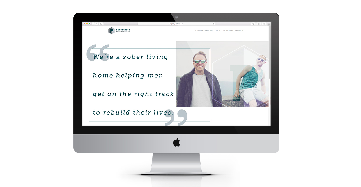
We were excited to take on Prosperity Recovery Residence as a client knowing it would be helping men recovering from drug & alcohol addiction. We created all of their branding & hand coded their responsive website.
BRANDING
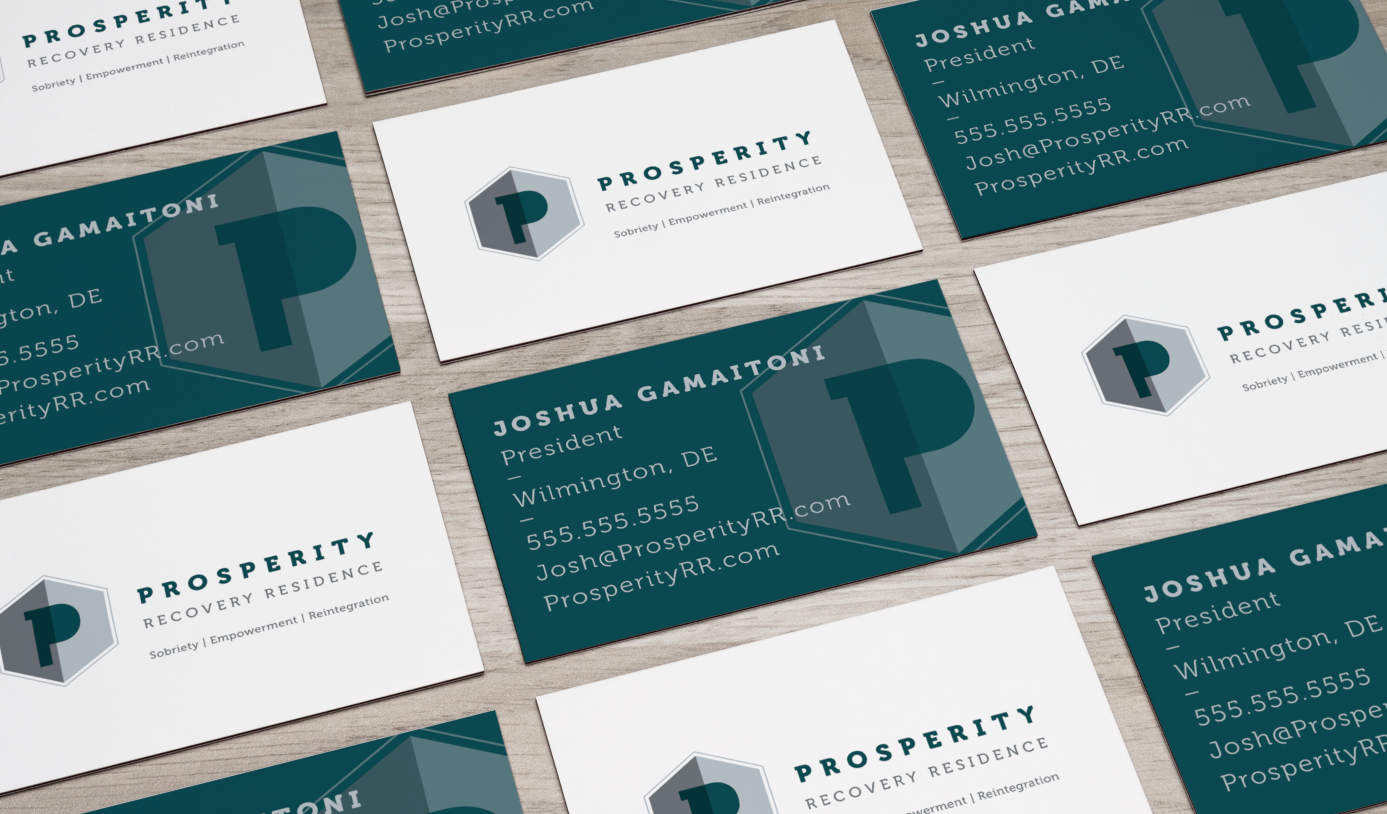
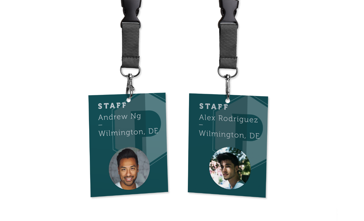
Most individuals in addiction start the road to recovery by using a 12 step program to help them get to the root of their problem. A hexagon and outer hexagon shape were used for the Prosperity logo to create 12 sides as a subtle nod to 12 steps of recovery. In addition to the 12 steps, there is a huge transformation in the life of a recovering addict. The dark to light grey effect in the prosperity logo represent life transformation.
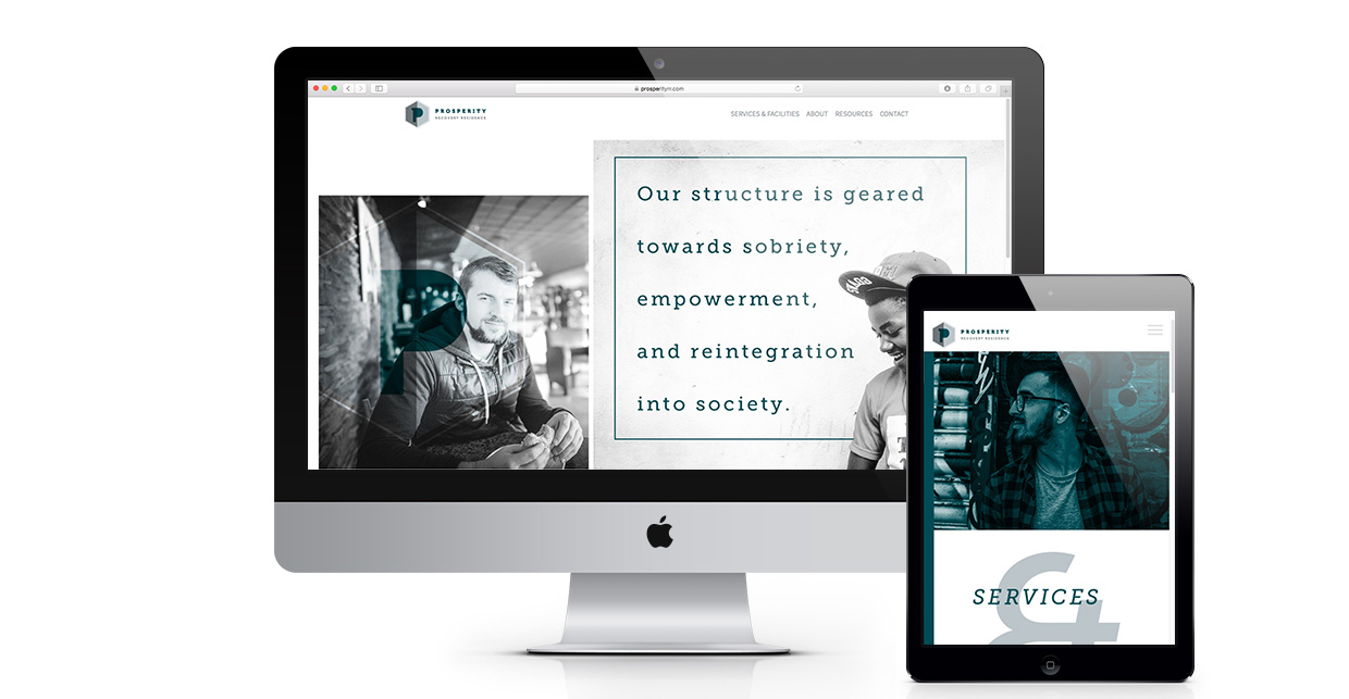
The Prosperity Recovery brand highlights the outcome of addiction, the positive life change. Throughout the site we use images of men who are happy & healthy while still maintaining an edgy feel.
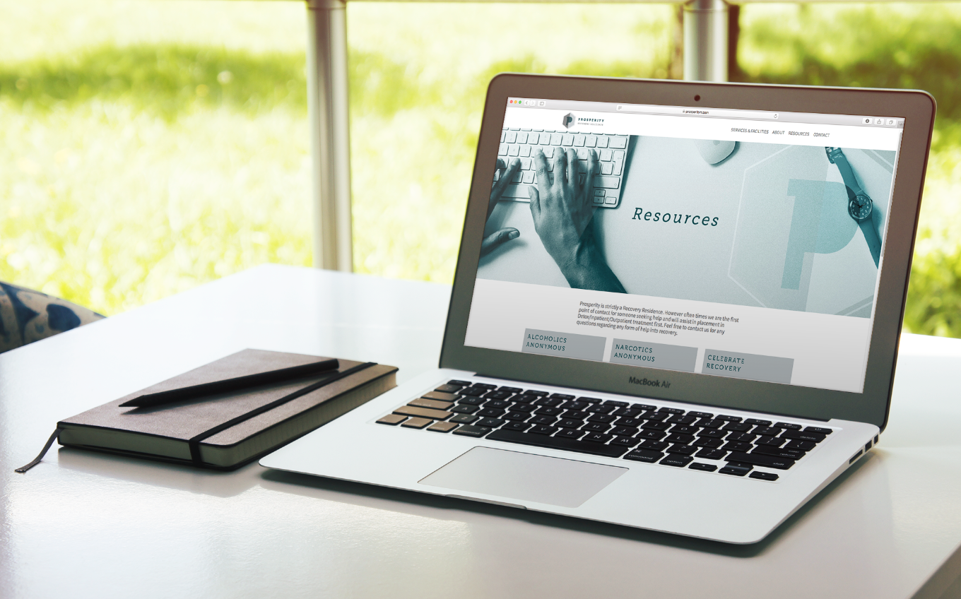
VISIT
Check out our work in action at: prosperityrr.com
