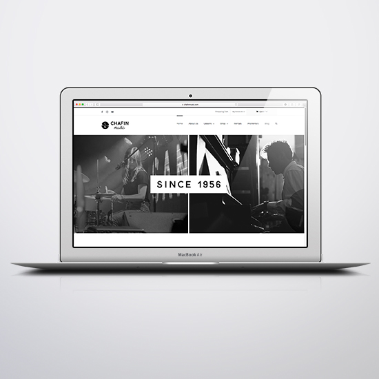
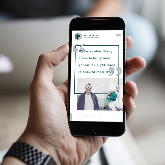
Image that says Recent Projects.

We take pride in using best practices to develop functional & responsive websites.

Sharper Conference website which we designed, developed and branded. This image shows the landing page with a sticky navigation to allow full functionality to the user regardless of their location on the page.
Schedule section of the Sharper Conference website. Here we used a flexbox layout to create a responsive schedule that looks great whether the user is on a small phone or a large desktop.
Workshops section for the Sharper Conference. Once again we used a flexbox layout to keep the sizing and margins appealing to the user from small to large viewports.
In this image we have a large hero image which gives location information to the user. It also serves as a link to another page which holds location based information for the user.
Large hero image with text thanking the user for considering to sign up for the conference. Upon clicking anywhere on the image the user is then taken to the registration page where they may fill out their information to sign up for the conference.